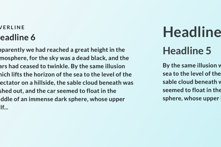
Just recently I felt the need to improve my typography skills for UI design, so I outlined this action plan for myself, and I hope it will also help you in designing better interfaces with better typographic choices!
Action 1. Read
Here are 5 books on typography that I consider must-reads for user interface design.
Thinking with Type: A Critical Guide for Designers, Writers, Editors, & Students
— by Ellen Lupton
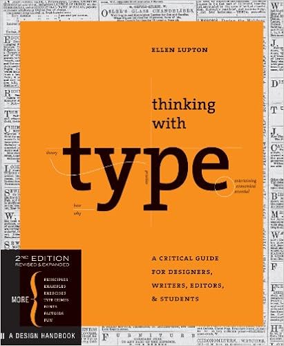
I first came across this book as a textbook for a design course. It laid the foundation for a solid understanding of typography.
I was able to use what I learned in design projects right away.
Filled with visual examples, this book is a definitive guide on typography for visual communication.
The Elements of Typographic Style
by Robert Bringhurst
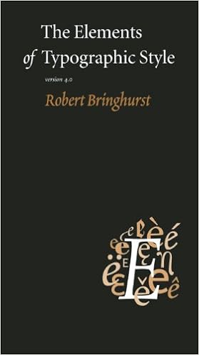
This is the book to get if you really want to nerd out on typography and get a deep dive into the technical aspects of it.
I love the parts of the book where the history and evolution of typefaces are discussed.
Getting to know the history of typography helped me understand what makes a font look old-timey, what makes it look modern and what gives it a contemporary twist.
This knowledge really comes in handy when choosing the right font pairings.
Parts of this book can be packed with exhausting details that you may not be able to read through in one sitting.
However, you can use the rules and guidelines for reference any time you want to create that typographic magic for a design project.
Type on Screen: A Critical Guide for Designers, Writers, Developers, and Students
by Ellen Lupton
![Type on Screen: A Critical Guide for Designers, Writers, Developers, and Students (Design Briefs) by [Lupton, Ellen]](https://images-na.ssl-images-amazon.com/images/I/51u-jz%2B6WsL.jpg)
This book concerns mainly typography in digital forms, such as how people read on different devices and common interaction patterns.
It also includes lots of example case studies that can immediately be put to use by a digital product designer.
I especially love the highly applicable do’s and don’ts on elements like navigation, tables and data display.
On Web Typography
by Jason Santa Maria

I wish I had read this book when I was a junior designer. It covers the essential aspects of typography that a digital product designer uses on a daily basis.
It includes sections on choosing and pairing fonts, setting hierarchy and creating contrast when composing a typographic system.
My favorite section of the book is when Jason cautions designers on using free fonts.
Before you go download and use that free font from a random corner of the internet, read this book first!
Webfont Handbook
by Bram Stein

When it comes time to implement the fonts that you have chosen for your designs, this is the book to get.
Whether you’re in a position to implement your own fonts of choice or you’re working with a developer, knowing the technicalities outlined in this book will help get your fonts to load fast and render correctly.
This will greatly reduce your chance of hearing: “Well, maybe we’ll just switch back to using Arial…”
Action 2. Practice
I wanted to give myself a chance to experiment with choosing and pairing fonts for a variety of projects.
You don’t always get to do that in a work situation, so here are two ways that I found that offer designers a chance to play and experiment.
Daily UI Challenge
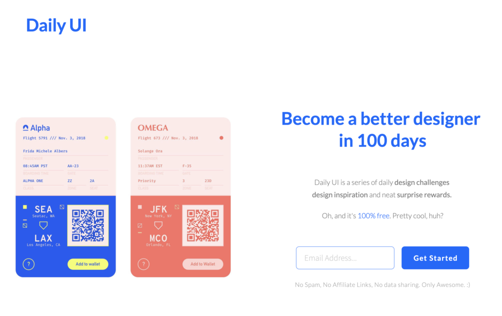
You’ve probably heard of the daily UI challenge before. It’s a great way to experiment with typography with a project a day sent by email.
These projects can be small and quick. Over time you may be surprised by the amount of work and progress you’ve made!
UX Challenge

If you want to practice your typographic skills for a design project that involves a specific audience and a problem space, hop over to UX Challenge (that I created!) and pick a challenge to work on (like this one).
Focus on how your typographic choices influence the user’s overall experience.
Action 3. Observe
Have the critical eye running in the background of your daily life

There are tons of typographical user interfaces in the physical environment that we live in.
For example, highway signs, furniture assembling instructions and emergency exit signs to name a few.
Keep an eye on how these text and signage look, and your experience interacting with them.
Keep a visual collection
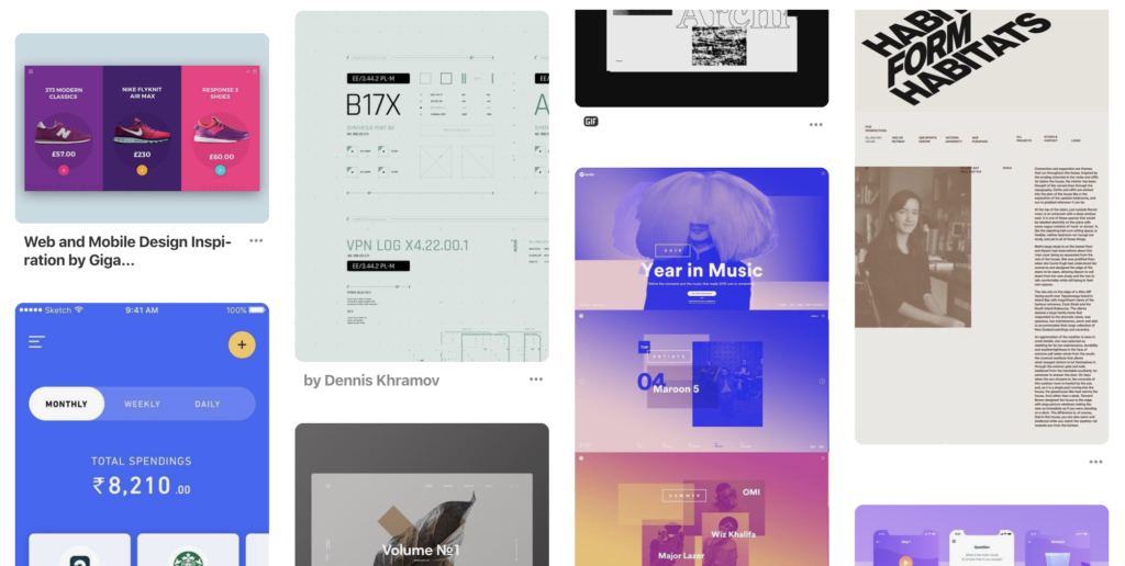
When you encounter interesting typography examples in digital products or design inspirations from around the web, take a screenshot and save them in a collection that you can go back to later.
When you need some inspiration for a project, you may just find the perfect solution from your personal visual collection.
It’s time for action
I hope this action plan gives you some steps that you can take right away to start honing your typographic skills for UI design.
I believe that no amount of reading or looking can replace doing the actual design work.
So go forth and design something with typography today!
